neer
MH Design – Brand Inspiration & Concept
MH Design transforms company names into complete, professional brand identities. From logo creation and colour palettes to typography and visual style, we develop a consistent design system that reflects the personality, values, and vision of each business. Our approach combines creativity with strategy to create brands that are memorable, adaptable, and ready to connect with audiences across all platforms.
Company Briefing – Neer Kombucha Beer
Neer Kombucha Beer is a refreshing, beer-inspired beverage that combines great taste with natural health benefits. Designed for moments of relaxation and recovery, Neer allows you to unwind while supporting your body’s wellbeing.
Unlike traditional beer, Neer is a healthier alternative that helps replenish your gut, support digestion, and keep you feeling refreshed and energised. Whether you’re relaxing after a long day or preparing for tomorrow, Neer provides a light and refreshing experience that keeps you feeling balanced and ready for what’s ahead.
Design Direction
The design direction was focused on creating a brand identity that feels cool, refreshing, and enjoyable in a tropical bar environment. The aim was to balance excitement and energy with a sense of health, cleanliness, and natural quality.
The branding combines a classic and timeless feel with modern, contemporary elements, creating a look that feels familiar yet fresh. Through a refined visual style, the brand communicates relaxation, vitality, and a refreshing alternative for today’s health-conscious consumers.


Logo
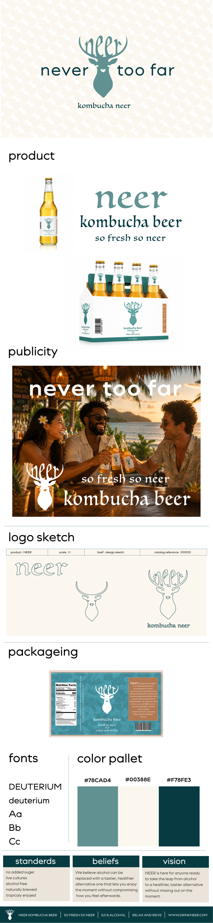
The Neer logo combines a traditional, natural feel with a contemporary twist. The design is created to feel warm, welcoming, and familiar while maintaining a sense of excitement and refreshment. It reflects the brand’s balance between natural wellbeing and modern enjoyment, creating an identity that feels approachable, timeless, and inviting.
Product
Neer is a cool and refreshing beverage designed to be enjoyed with friends in a relaxed and inviting atmosphere. With its light, crisp character and healthy benefits, it creates the perfect balance between social enjoyment and mindful living. Whether shared at a tropical bar or enjoyed during everyday moments, Neer brings a refreshing experience with a positive feel.
Slogan
The slogan is designed to attract consumers while communicating Neer’s accessible and inviting nature. It creates a sense of availability, encouraging people to enjoy a refreshing beverage that fits naturally into social moments, relaxation, and everyday experiences.
Packaging
The packaging is designed to be eye-catching while maintaining a sense of depth and timelessness.
The visual style aims to create a strong first impression while building a lasting connection with consumers. By combining distinctive design elements with a refined and enduring look, the packaging reflects Neer’s refreshing, natural, and trustworthy identity.
Typography
The typography is clear, welcoming, and modern, reflecting Neer’s refreshing and approachable personality. The font style creates a balance between simplicity and character, making the brand feel easy to connect with while maintaining a clean and contemporary appearance.
Colour Palette
The colour palette is carefully chosen to create a warm, natural, and welcoming feeling. The tones reflect Neer’s connection to freshness, wellbeing, and relaxed social experiences, while creating a visual identity that feels approachable, refreshing, and timeless.
neer



neer
MH Design – Brand Inspiration & Concept
MH Design transforms company names into complete, professional brand identities. From logo creation and colour palettes to typography and visual style, we develop a consistent design system that reflects the personality, values, and vision of each business. Our approach combines creativity with strategy to create brands that are memorable, adaptable, and ready to connect with audiences across all platforms.
Company Briefing – Neer Kombucha Beer
Neer Kombucha Beer is a refreshing, beer-inspired beverage that combines great taste with natural health benefits. Designed for moments of relaxation and recovery, Neer allows you to unwind while supporting your body’s wellbeing.
Unlike traditional beer, Neer is a healthier alternative that helps replenish your gut, support digestion, and keep you feeling refreshed and energised. Whether you’re relaxing after a long day or preparing for tomorrow, Neer provides a light and refreshing experience that keeps you feeling balanced and ready for what’s ahead.
Design Direction
The design direction was focused on creating a brand identity that feels cool, refreshing, and enjoyable in a tropical bar environment. The aim was to balance excitement and energy with a sense of health, cleanliness, and natural quality.
The branding combines a classic and timeless feel with modern, contemporary elements, creating a look that feels familiar yet fresh. Through a refined visual style, the brand communicates relaxation, vitality, and a refreshing alternative for today’s health-conscious consumers.
Logo
The Neer logo combines a traditional, natural feel with a contemporary twist. The design is created to feel warm, welcoming, and familiar while maintaining a sense of excitement and refreshment. It reflects the brand’s balance between natural wellbeing and modern enjoyment, creating an identity that feels approachable, timeless, and inviting.
Product
Neer is a cool and refreshing beverage designed to be enjoyed with friends in a relaxed and inviting atmosphere. With its light, crisp character and healthy benefits, it creates the perfect balance between social enjoyment and mindful living. Whether shared at a tropical bar or enjoyed during everyday moments, Neer brings a refreshing experience with a positive feel.
Slogan
The slogan is designed to attract consumers while communicating Neer’s accessible and inviting nature. It creates a sense of availability, encouraging people to enjoy a refreshing beverage that fits naturally into social moments, relaxation, and everyday experiences.
Packaging
The packaging is designed to be eye-catching while maintaining a sense of depth and timelessness.
The visual style aims to create a strong first impression while building a lasting connection with consumers. By combining distinctive design elements with a refined and enduring look, the packaging reflects Neer’s refreshing, natural, and trustworthy identity.
Typography
The typography is clear, welcoming, and modern, reflecting Neer’s refreshing and approachable personality. The font style creates a balance between simplicity and character, making the brand feel easy to connect with while maintaining a clean and contemporary appearance.
Colour Palette
The colour palette is carefully chosen to create a warm, natural, and welcoming feeling. The tones reflect Neer’s connection to freshness, wellbeing, and relaxed social experiences, while creating a visual identity that feels approachable, refreshing, and timeless.
Logo
The Neer logo combines a traditional, natural feel with a contemporary twist. The design is created to feel warm, welcoming, and familiar while maintaining a sense of excitement and refreshment. It reflects the brand’s balance between natural wellbeing and modern enjoyment, creating an identity that feels approachable, timeless, and inviting.
Product
Neer is a cool and refreshing beverage designed to be enjoyed with friends in a relaxed and inviting atmosphere. With its light, crisp character and healthy benefits, it creates the perfect balance between social enjoyment and mindful living. Whether shared at a tropical bar or enjoyed during everyday moments, Neer brings a refreshing experience with a positive feel.
Slogan
The slogan is designed to attract consumers while communicating Neer’s accessible and inviting nature. It creates a sense of availability, encouraging people to enjoy a refreshing beverage that fits naturally into social moments, relaxation, and everyday experiences.
Packaging
The packaging is designed to be eye-catching while maintaining a sense of depth and timelessness.
The visual style aims to create a strong first impression while building a lasting connection with consumers. By combining distinctive design elements with a refined and enduring look, the packaging reflects Neer’s refreshing, natural, and trustworthy identity.
Typography
The typography is clear, welcoming, and modern, reflecting Neer’s refreshing and approachable personality. The font style creates a balance between simplicity and character, making the brand feel easy to connect with while maintaining a clean and contemporary appearance.
Colour Palette
The colour palette is carefully chosen to create a warm, natural, and welcoming feeling. The tones reflect Neer’s connection to freshness, wellbeing, and relaxed social experiences, while creating a visual identity that feels approachable, refreshing, and timeless.

neer
MH Design – Brand Inspiration & Concept
MH Design transforms company names into complete, professional brand identities. From logo creation and colour palettes to typography and visual style, we develop a consistent design system that reflects the personality, values, and vision of each business. Our approach combines creativity with strategy to create brands that are memorable, adaptable, and ready to connect with audiences across all platforms.
Company Briefing – Neer Kombucha Beer
Neer Kombucha Beer is a refreshing, beer-inspired beverage that combines great taste with natural health benefits. Designed for moments of relaxation and recovery, Neer allows you to unwind while supporting your body’s wellbeing.
Unlike traditional beer, Neer is a healthier alternative that helps replenish your gut, support digestion, and keep you feeling refreshed and energised. Whether
you’re relaxing after a long day or preparing for tomorrow, Neer provides a light and refreshing experience that keeps you feeling balanced and ready for what’s ahead.
Design Direction
The design direction was focused on creating a brand identity that feels cool, refreshing, and enjoyable in a tropical bar environment. The aim was to balance excitement and energy with a sense of health, cleanliness, and natural quality.
The branding combines a classic and timeless feel with modern, contemporary elements, creating a look that feels familiar yet fresh. Through a refined visual style, the brand communicates relaxation, vitality, and a refreshing alternative for today’s health-conscious consumers.
Logo
The Neer logo combines a traditional, natural feel with a contemporary twist. The design is created to feel warm, welcoming, and familiar while maintaining a sense of excitement and refreshment. It reflects the brand’s balance between natural wellbeing and modern enjoyment, creating an identity that feels approachable, timeless, and inviting.
Product
Neer is a cool and refreshing beverage designed to be enjoyed with friends in a relaxed and inviting atmosphere. With its light, crisp character and healthy benefits, it creates the perfect balance between social enjoyment and mindful living. Whether shared at a tropical bar or enjoyed during everyday moments, Neer brings a refreshing experience with a positive feel.
Slogan
The slogan is designed to attract consumers while communicating Neer’s accessible and inviting nature. It creates a sense of availability, encouraging people to enjoy a refreshing beverage that fits naturally into social moments, relaxation, and everyday experiences.
Packaging
The packaging is designed to be eye-catching while maintaining a sense of depth and timelessness.
The visual style aims to create a strong first impression while building a lasting connection with consumers. By combining distinctive design elements with a refined and enduring look, the packaging reflects Neer’s refreshing, natural, and trustworthy identity.
Typography
The typography is clear, welcoming, and modern, reflecting Neer’s refreshing and approachable personality. The font style creates a balance between simplicity and character, making the brand feel easy to connect with while maintaining a clean and contemporary appearance.
Colour Palette
The colour palette is carefully chosen to create a warm, natural, and welcoming feeling. The tones reflect Neer’s connection to freshness, wellbeing, and relaxed social experiences, while creating a visual identity that feels approachable, refreshing, and timeless.
