HOT KEEPER
MH Design – App Development
MH Design brings app ideas to life through professional app development services. From initial concept and user-focused design to development and launch, we collaborate with trusted development partners to create intuitive, high-quality mobile applications tailored to your business goals.
Our approach combines creative design, strategic thinking, and reliable technology to deliver apps that are engaging, functional, and built to support business growth.
Company Briefing – Hot Keeper
Hot Keeper is a simple, secure application designed to connect two sides through a unique property-sharing service. The platform allows owners of seasonal properties to lease their homes during off-peak periods, helping them generate value from spaces that would otherwise remain unused.
At the same time, Hot Keeper provides flexible living opportunities for people and families who want to embrace a mobile lifestyle. Users can enjoy staying in beautiful holiday destinations for extended periods, moving from one location to another while avoiding high-season prices and experiencing the best each place has to offer.
Hot Keeper creates a new way of living and travelling—connecting property owners with modern explorers through affordable, flexible, and secure long-term stays.
Design Direction
For the Hot Keeper logo, the design direction focused on creating an identity that represents security, functionality, and a welcoming sense of home. The goal was to balance a professional and trustworthy appearance with a warm, approachable feel that reflects the connection between property owners and people seeking flexible living experiences.
The branding combines reliability and comfort, communicating a service that is safe, practical, and designed to make every place feel like home.
Company Values
The core principles of Hot Keeper are built around providing a high-end, efficient, and accessible service that delivers the perfect short-term home experience. The platform is designed to guarantee that users find accommodation that meets their individual needs, whether it is a peaceful retreat for work and family life or a convenient city stay with all the necessary amenities for remote living.
The overall brand aesthetic should communicate trust, quality, comfort, and flexibility, reflecting a service that makes temporary living feel effortless, secure, and like home.
Slogan
The slogan “Seasonal Abode” represents Hot Keeper’s main objective: creating opportunities for comfortable temporary stays that feel like home. It reflects the idea of experiencing different locations throughout the year while enjoying the comfort, security, and familiarity of a personal living space wherever you go.
Logo
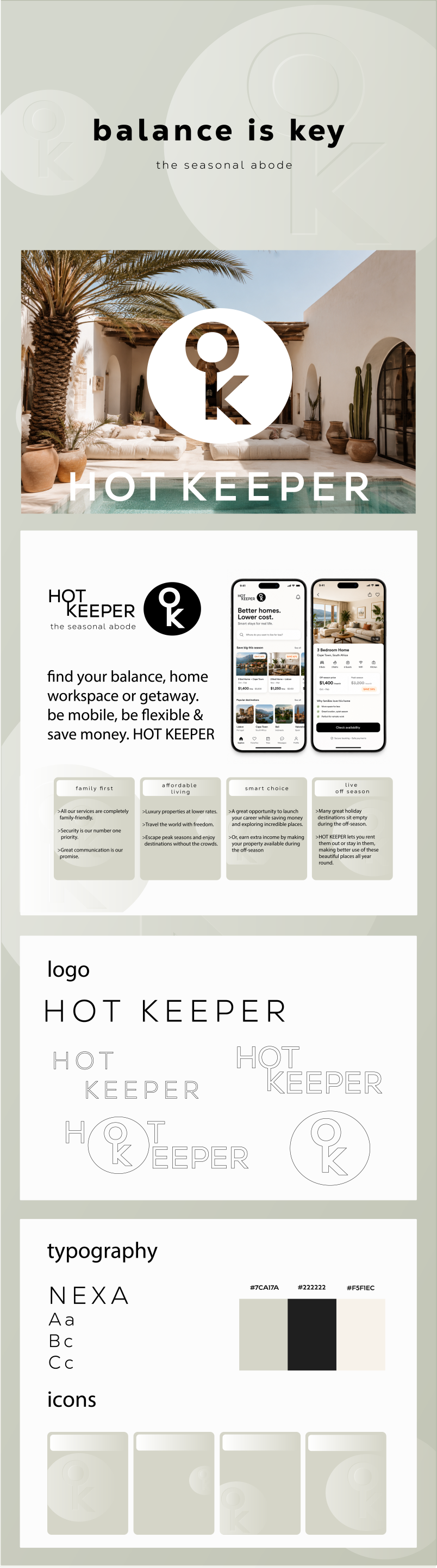
The Hot Keeper logo transforms the company name into a key-inspired shape, reinforcing the idea of security and access. By combining the O and K into a lettermark resembling a keyhole, the design creates a strong visual connection to protection, trust, and safe living spaces. This approach achieves the overall goal of communicating a secure, reliable, and welcoming service.
Typography
The font Nexa was chosen as the foundation of the Hot Keeper brand identity due to its clear and strong characteristics, creating a sense of security and reliability. Its sleek and refined structure also adds a feeling of warmth and approachability, maintaining a balance between professionalism and a homely atmosphere.
Colour Palette
The primary colour is a warm, natural shade of green that represents nature, wellbeing, and balance. It encourages customers to imagine a tranquil and relaxing environment, whether for work, rest, or personal time.
The secondary colour is a soft beige tone that creates a sense of warmth, comfort, and welcome. It reflects the feeling of home—a place to create memories, relax, and build a lifestyle.
A darker supporting tone is introduced to add contrast, depth, and structure, bringing the overall visual identity together while reinforcing trust, quality, and sophistication.
Icons
The icons are designed to simplify the user experience and provide clear, intuitive navigation throughout the app. Each icon creates a direct pathway to the platform’s key features and values, making the service easy to understand and accessible while reinforcing Hot Keeper’s focus on convenience, reliability, and user-friendly design.
Result
Everything came together successfully for this project, creating a practical and valuable app that benefits all parties involved. Hot Keeper provides customers with more affordable and flexible living opportunities, while allowing property owners to generate income from spaces that would otherwise remain unused.
The final brand identity reflects the app’s core values of trust, accessibility, and convenience, creating a service that connects people with comfortable homes while maximising the potential of seasonal properties.





HOT KEEPER
MH Design – App Development
MH Design brings app ideas to life through professional app development services. From initial concept and user-focused design to development and launch, we collaborate with trusted development partners to create intuitive, high-quality mobile applications tailored to your business goals.
Our approach combines creative design, strategic thinking, and reliable technology to deliver apps that are engaging, functional, and built to support business growth.
Company Briefing – Hot Keeper
Hot Keeper is a simple, secure application designed to connect two sides through a unique property-sharing service. The platform allows owners of seasonal properties to lease their homes during off-peak periods, helping them generate value from spaces that would otherwise remain unused.
At the same time, Hot Keeper provides flexible living opportunities for people and families who want to embrace a mobile lifestyle. Users can enjoy staying in beautiful holiday destinations for extended periods, moving from one location to another while avoiding high-season prices and experiencing the best each place has to offer.
Hot Keeper creates a new way of living and travelling—connecting property owners with modern explorers through affordable, flexible, and secure long-term stays.
Design Direction
For the Hot Keeper logo, the design direction focused on creating an identity that represents security, functionality, and a welcoming sense of home. The goal was to balance a professional and trustworthy appearance with a warm, approachable feel that reflects the connection between property owners and people seeking flexible living experiences.
The branding combines reliability and comfort, communicating a service that is safe, practical, and designed to make every place feel like home.
Company Values
The core principles of Hot Keeper are built around providing a high-end, efficient, and accessible service that delivers the perfect short-term home experience. The platform is designed to guarantee that users find accommodation that meets their individual needs, whether it is a peaceful retreat for work and family life or a convenient city stay with all the necessary amenities for remote living.
The overall brand aesthetic should communicate trust, quality, comfort, and flexibility, reflecting a service that makes temporary living feel effortless, secure, and like home.
Slogan
The slogan “Seasonal Abode” represents Hot Keeper’s main objective: creating opportunities for comfortable temporary stays that feel like home. It reflects the idea of experiencing different locations throughout the year while enjoying the comfort, security, and familiarity of a personal living space wherever you go.
Logo
The Hot Keeper logo transforms the company name into a key-inspired shape, reinforcing the idea of security and access. By combining the O and K into a lettermark resembling a keyhole, the design creates a strong visual connection to protection, trust, and safe living spaces. This approach achieves the overall goal of communicating a secure, reliable, and welcoming service.
Typography
The font Nexa was chosen as the foundation of the Hot Keeper brand identity due to its clear and strong characteristics, creating a sense of security and reliability. Its sleek and refined structure also adds a feeling of warmth and approachability, maintaining a balance between professionalism and a homely atmosphere.
Colour Palette
The primary colour is a warm, natural shade of green that represents nature, wellbeing, and balance. It encourages customers to imagine a tranquil and relaxing environment, whether for work, rest, or personal time.
The secondary colour is a soft beige tone that creates a sense of warmth, comfort, and welcome. It reflects the feeling of home—a place to create memories, relax, and build a lifestyle.
A darker supporting tone is introduced to add contrast, depth, and structure, bringing the overall visual identity together while reinforcing trust, quality, and sophistication.
Icons
The icons are designed to simplify the user experience and provide clear, intuitive navigation throughout the app. Each icon creates a direct pathway to the platform’s key features and values, making the service easy to understand and accessible while reinforcing Hot Keeper’s focus on convenience, reliability, and user-friendly design.
Result
Everything came together successfully for this project, creating a practical and valuable app that benefits all parties involved. Hot Keeper provides customers with more affordable and flexible living opportunities, while allowing property owners to generate income from spaces that would otherwise remain unused.
The final brand identity reflects the app’s core values of trust, accessibility, and convenience, creating a service that connects people with comfortable homes while maximising the potential of seasonal properties.



HOT KEEPER

MH Design – App Development
MH Design brings app ideas to life through professional app development services. From initial concept and user-focused design to development and launch, we collaborate with trusted development partners to create intuitive, high-quality mobile applications tailored to your business goals.
Our approach combines creative design, strategic thinking, and reliable technology to deliver apps that are engaging, functional, and built to support business growth.
Company Briefing – Hot Keeper
Hot Keeper is a simple, secure application designed to connect two sides through a unique property-sharing service. The platform allows owners of seasonal properties to lease their homes during off-peak periods, helping them generate value from spaces that would otherwise remain unused.
At the same time, Hot Keeper provides flexible living opportunities for people and families who want to embrace a mobile lifestyle. Users can enjoy staying in beautiful holiday destinations for extended periods, moving from one location to another while avoiding high-season prices and experiencing the best each place has to offer.
Hot Keeper creates a new way of living and travelling—connecting property owners with modern explorers through affordable, flexible, and secure long-term stays.
Design Direction
For the Hot Keeper logo, the design direction focused on creating an identity that represents security, functionality, and a welcoming sense of home. The goal was to balance a professional and trustworthy appearance with a warm, approachable feel that reflects the connection between property owners and people seeking flexible living experiences.
The branding combines reliability and comfort, communicating a service that is safe, practical, and designed to make every place feel like home.
Company Values
The core principles of Hot Keeper are built around providing a high-end, efficient, and accessible service that delivers the perfect short-term home experience. The platform is designed to guarantee that users find accommodation that meets their individual needs, whether it is a peaceful retreat for work and family life or a convenient city stay with all the necessary amenities for remote living.
The overall brand aesthetic should communicate trust, quality, comfort, and flexibility, reflecting a service that makes temporary living feel effortless, secure, and like home.
Slogan
The slogan “Seasonal Abode” represents Hot Keeper’s main objective: creating opportunities for comfortable temporary stays that feel like home. It reflects the idea of experiencing different locations throughout the year while enjoying the comfort, security, and familiarity of a personal living space wherever you go.
Logo
The Hot Keeper logo transforms the company name into a key-inspired shape, reinforcing the idea of security and access. By combining the O and K into a lettermark resembling a keyhole, the design creates a strong visual connection to protection, trust, and safe living spaces. This approach achieves the overall goal of communicating a secure, reliable, and welcoming service.
Typography
The font Nexa was chosen as the foundation of the Hot Keeper brand identity due to its clear and strong characteristics, creating a sense of security and reliability. Its sleek and refined structure also adds a feeling of warmth and approachability, maintaining a balance between professionalism and a homely atmosphere.
Colour Palette
The primary colour is a warm, natural shade of green that represents nature, wellbeing, and balance. It encourages customers to imagine a tranquil and relaxing environment, whether for work, rest, or personal time.
The secondary colour is a soft beige tone that creates a sense of warmth, comfort, and welcome. It reflects the feeling of home—a place to create memories, relax, and build a lifestyle.
A darker supporting tone is introduced to add contrast, depth, and structure, bringing the overall visual identity together while reinforcing trust, quality, and sophistication.
Icons
The icons are designed to simplify the user experience and provide clear, intuitive navigation throughout the app. Each icon creates a direct pathway to the platform’s key features and values, making the service easy to understand and accessible while reinforcing Hot Keeper’s focus on convenience, reliability, and user-friendly design.
Result
Everything came together successfully for this project, creating a practical and valuable app that benefits all parties involved. Hot Keeper provides customers with more affordable and flexible living opportunities, while allowing property owners to generate income from spaces that would otherwise remain unused.
The final brand identity reflects the app’s core values of trust, accessibility, and convenience, creating a service that connects people with comfortable homes while maximising the potential of seasonal properties.

