Harvest Works
MH Design – Complete Branding Package
MH Design creates distinctive brands and thoughtfully designed products that help businesses stand out in competitive markets. From developing memorable brand identities to creating innovative, market-ready products, we combine creativity with strategic thinking to deliver solutions that connect with customers, strengthen brand presence, and support long-term business growth.
Company Breifing- Harvest Works
Harvest Works provides innovative carports equipped with integrated solar panels and wind turbines, enabling clean, renewable energy generation while offering reliable vehicle protection. These sustainable carport solutions are designed to maximize energy efficiency, reduce electricity costs, and support environmentally responsible residential, commercial, and industrial developments.
Design Direction
The design direction was focused on creating a brand identity that is eye-catching while remaining serious, calculated, and professional. The goal was to develop a visual style that feels energetic and full of life, while also communicating reliability, trust, and confidence. Through a balance of bold design choices and thoughtful details, the brand reflects innovation, strength, and a dependable presence in the market.
Colour
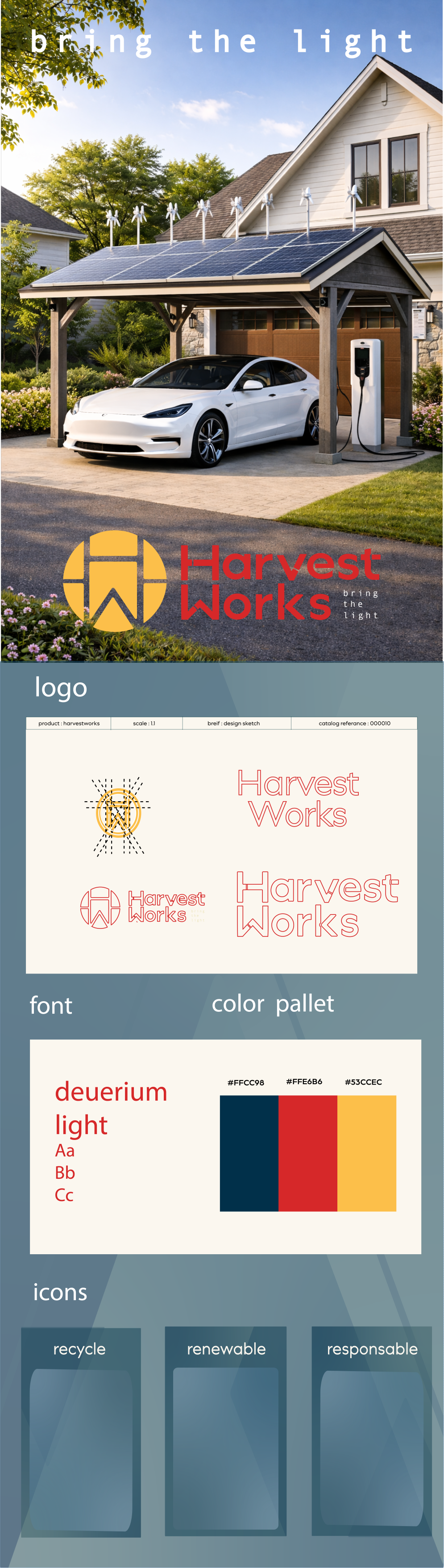
The logo uses a warm yellow tone inspired by the sun, the most essential element in solar energy generation. This colour represents light, energy, and positivity, reflecting Harvest Works' mission to transform natural resources into sustainable power solutions. The warm tone creates a sense of reliability and innovation while reinforcing the brand’s connection to renewable energy and a brighter future.
Logo
The Harvest Works logo combines the H from Harvest and the W from Works to create a circular mark that represents sustainability and continuous energy. Inspired by the geometric patterns of solar panels, the design reflects the company's focus on clean, innovative renewable energy solutions.
Slogan
Bring the Light reflects the mission of Harvest Works to transform renewable energy into everyday power. It symbolizes clean energy, innovation, and a commitment to a more sustainable future. Through integrated solar and wind technologies, Harvest Works provides reliable energy solutions that power homes, charge vehicles, and support a greener way of living.


Result
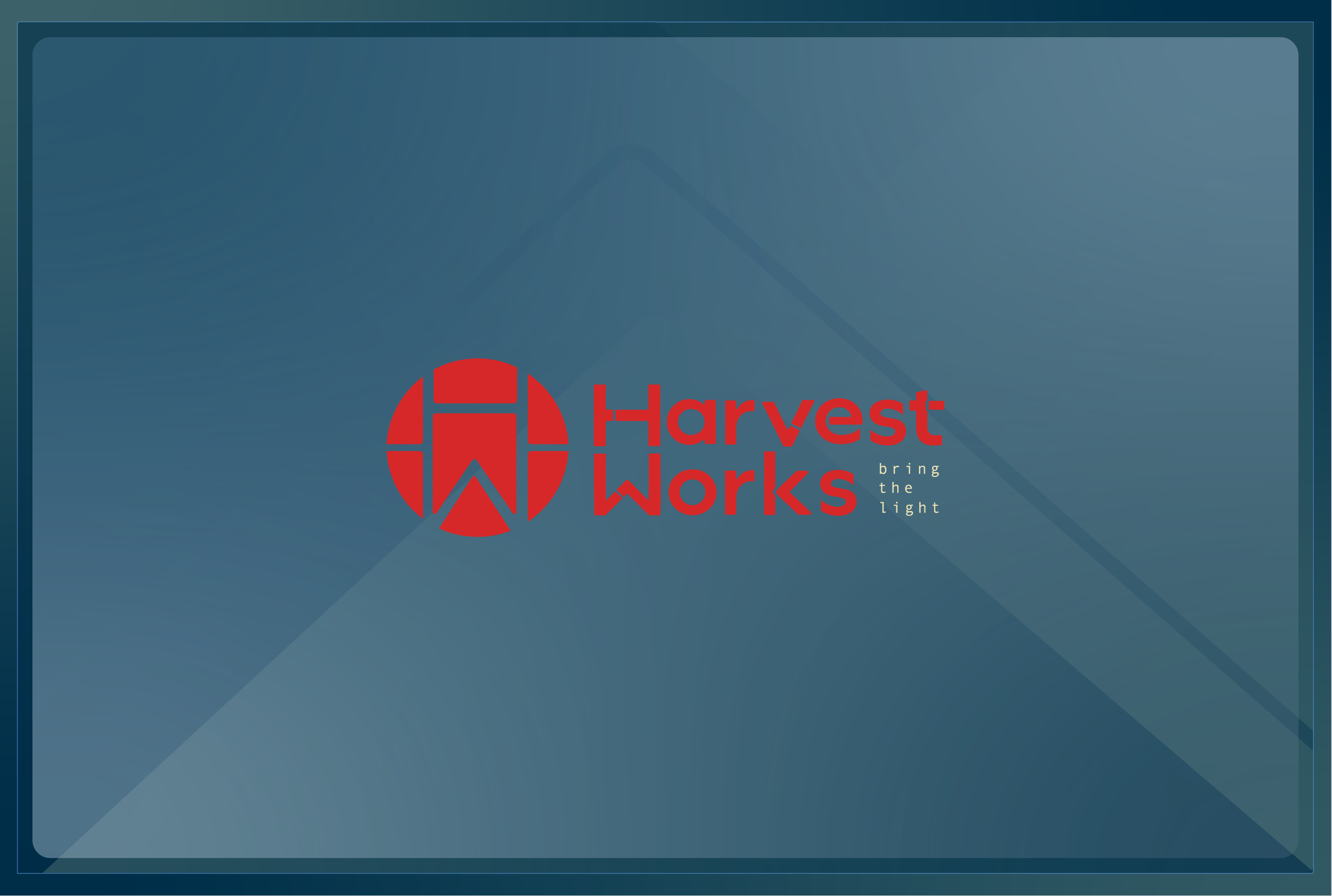
The final outcome is a complete and cohesive brand identity that clearly represents the core values and fundamentals of the company. Every design element works together to communicate Harvest Works’ vision, from its commitment to renewable energy and innovation to its focus on reliability and trust.
The branding creates a strong and recognisable presence that connects with customers through clarity, purpose, and consistency. It reflects a company built around sustainable solutions, while presenting a professional and forward-thinking image that inspires confidence in the future of clean energy.
Theme
The background theme uses a combination of light blue and clear sections to represent the open sky and the natural environment surrounding renewable energy. These elements create a strong visual connection to solar power, reflecting sunlight, clean air, and sustainability. The overall theme reinforces Harvest Works’ relationship with nature and its mission to deliver clean, renewable energy solutions.
Typography
The typography used for Harvest Works is clear, strong, and practical, reflecting the reliable and hardworking nature of the company. The bold, workman-like style creates a sense of strength, trust, and durability, representing a brand dedicated to delivering dependable energy solutions. The font choice reinforces the idea of a company committed to providing the power people need through innovative renewable technologies.


Harvest Works
MH Design – Complete Branding Package
MH Design creates distinctive brands and thoughtfully designed products that help businesses stand out in competitive markets. From developing memorable brand identities to creating innovative, market-ready products, we combine creativity with strategic thinking to deliver solutions that connect with customers, strengthen brand presence, and support long-term business growth.
Company Breifing- Harvest Works
Harvest Works provides innovative carports equipped with integrated solar panels and wind turbines, enabling clean, renewable energy generation while offering reliable vehicle protection. These sustainable carport solutions are designed to maximize energy efficiency, reduce electricity costs, and support environmentally responsible residential, commercial, and industrial developments.
Design Direction
The design direction was focused on creating a brand identity that is eye-catching while remaining serious, calculated, and professional. The goal was to develop a visual style that feels energetic and full of life, while also communicating reliability, trust, and confidence. Through a balance of bold design choices and thoughtful details, the brand reflects innovation, strength, and a dependable presence in the market.
Colour
The logo uses a warm yellow tone inspired by the sun, the most essential element in solar energy generation. This colour represents light, energy, and positivity, reflecting Harvest Works' mission to transform natural resources into sustainable power solutions. The warm tone creates a sense of reliability and innovation while reinforcing the brand’s connection to renewable energy and a brighter future.
Logo
The Harvest Works logo combines the H from Harvest and the W from Works to create a circular mark that represents sustainability and continuous energy. Inspired by the geometric patterns of solar panels, the design reflects the company's focus on clean, innovative renewable energy solutions.
Slogan
Bring the Light reflects the mission of Harvest Works to transform renewable energy into everyday power. It symbolizes clean energy, innovation, and a commitment to a more sustainable future. Through integrated solar and wind technologies, Harvest Works provides reliable energy solutions that power homes, charge vehicles, and support a greener way of living.

Result
The final outcome is a complete and cohesive brand identity that clearly represents the core values and fundamentals of the company. Every design element works together to communicate Harvest Works’ vision, from its commitment to renewable energy and innovation to its focus on reliability and trust.
The branding creates a strong and recognisable presence that connects with customers through clarity, purpose, and consistency. It reflects a company built around sustainable solutions, while presenting a professional and forward-thinking image that inspires confidence in the future of clean energy.
Theme
The background theme uses a combination of light blue and clear sections to represent the open sky and the natural environment surrounding renewable energy. These elements create a strong visual connection to solar power, reflecting sunlight, clean air, and sustainability. The overall theme reinforces Harvest Works’ relationship with nature and its mission to deliver clean, renewable energy solutions.
Typography
The typography used for Harvest Works is clear, strong, and practical, reflecting the reliable and hardworking nature of the company. The bold, workman-like style creates a sense of strength, trust, and durability, representing a brand dedicated to delivering dependable energy solutions. The font choice reinforces the idea of a company committed to providing the power people need through innovative renewable technologies.


Harvest Works
MH Design – Complete Branding Package
MH Design creates distinctive brands and thoughtfully designed products that help businesses stand out in competitive markets. From developing memorable brand identities to creating innovative, market-ready products, we combine creativity with strategic thinking to deliver solutions that connect with customers, strengthen brand presence, and support long-term business growth.
Company Breifing- Harvest Works
Harvest Works provides innovative carports equipped with integrated solar panels and wind turbines, enabling clean, renewable energy generation while offering reliable vehicle protection. These sustainable carport solutions are designed to maximize energy efficiency, reduce electricity costs, and support environmentally responsible residential, commercial, and industrial developments.
Design Direction
The design direction was focused on creating a brand identity that is eye-catching while remaining serious, calculated, and professional. The goal was to develop a visual style that feels energetic and full of life, while also communicating reliability, trust, and confidence. Through a balance of bold design choices and thoughtful details, the brand reflects innovation, strength, and a dependable presence in the market.
Colour
The logo uses a warm yellow tone inspired by the sun, the most essential element in solar energy generation. This colour represents light, energy, and positivity, reflecting Harvest Works' mission to transform natural resources into sustainable power solutions. The warm tone creates a sense of reliability and innovation while reinforcing the brand’s connection to renewable energy and a brighter future.
Logo
The Harvest Works logo combines the H from Harvest and the W from Works to create a circular mark that represents sustainability and continuous energy. Inspired by the geometric patterns of solar panels, the design reflects the company's focus on clean, innovative renewable energy solutions.
Slogan
Bring the Light reflects the mission of Harvest Works to transform renewable energy into everyday power. It symbolizes clean energy, innovation, and a commitment to a more sustainable future. Through integrated solar and wind technologies, Harvest Works provides reliable energy solutions that power homes, charge vehicles, and support a greener way of living.
Result
The final outcome is a complete and cohesive brand identity that clearly represents the core values and fundamentals of the company. Every design element works together to communicate Harvest Works’ vision, from its commitment to renewable energy and innovation to its focus on reliability and trust.
The branding creates a strong and recognisable presence that connects with customers through clarity, purpose, and consistency. It reflects a company built around sustainable solutions, while presenting a professional and forward-thinking image that inspires confidence in the future of clean energy.
Theme
The background theme uses a combination of light blue and clear sections to represent the open sky and the natural environment surrounding renewable energy. These elements create a strong visual connection to solar power, reflecting sunlight, clean air, and sustainability. The overall theme reinforces Harvest Works’ relationship with nature and its mission to deliver clean, renewable energy solutions.
Typography
The typography used for Harvest Works is clear, strong, and practical, reflecting the reliable and hardworking nature of the company. The bold, workman-like style creates a sense of strength, trust, and durability, representing a brand dedicated to delivering dependable energy solutions. The font choice reinforces the idea of a company committed to providing the power people need through innovative renewable technologies.
